Please don't think that I will give up and use your software if you make the button to uninstall it difficult enough to find.
The latest version of Skype believes that the ‘pin to taskbar’ feature in Windows 7 is so wonderful that it does not allow me to use the program any other way. This is achieved by dint of a rather ugly kludge: the main window cannot be closed; merely minimised. There are separate minimise and close buttons, but they are are exactly equivalent. Skype so resent the idea that I would want to pin Chrome to my taskbar but not their IM client that the only way to close their window is to run it in compatibility mode for Windows Vista, which didn’t have ‘pinning’ and so couldn’t offend Skype’s delicate sensibilities.
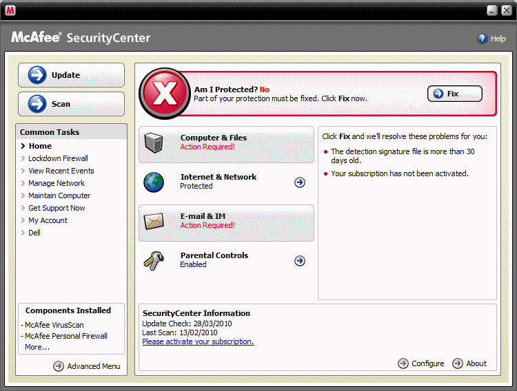
The problem here is that while Microsoft have spent the last 25 years building Windows, tweaking its usability, testing it, and building interface elements for application designers to use, application designers often reckon they know better. Even if that was true, the inconsistency would still be confusing, just like DVD menus are that bit harder to use for all being laid out differently. Nobody likes DVD menus. They’re spoiler-filled, self-congratulatory exercises in form over function designed by failed Flash-game developers. There isn’t one user in the world who wouldn’t rather have a straightforward list of options in a clear font on a plain background. Media playing software is particularly bad for this, second only to laptop manufacturers, who invariably think they need to make usability a unique selling point, and so write their own software to control wifi and touchpads and so forth. It’s always fucking awful, with shitty, blurry buttons made in Paint Shop Pro 5, scrollbars that don’t quite work, oval windows that look like an MP3 player from 1998 when a native square one would suffice… But it’s more annoying when big, dedicated software companies do it. Here, for example, is McAfee Security Centre, which came preinstalled on my otherwise lovely new Dell laptop:
If it was me, this would look like part of the Windows Control Panel. But, no. Its labyrinthine navigation city can only be explored using a mouse, and if there’s an option to just turn the wretched thing off without uninstalling it completely then I can’t find it. I suspect there isn’t, since it describes turning itself on as ‘fixing’ a problem; an action which is ‘required’. To me, a seasoned geek, this is simply patronising. To a novice user, it’s intimidating. I would go so far as to say it is deliberately intimidating, bullying the user into paying the subscription using threatening language and graphics. I say this in part because of the email Ben got from them which reads
Internet thugs are motivated, ruthless…and silent. They use stealth to invade your computer system. It can happen so quickly, you won’t even realize it—at least not until after your credit score plunges.
But my issue here is not their Mafia-style marketing techniques, but the interface. Keyboard shortcuts allow the user to ‘click’ the left hand menu and the logo (which doesn’t do anything) but not any of the actual controls. I can only assume none of it responds to Windows’ accessibility options. Certainly none of the controls feel familiar. Look at the ‘minimise’ and ‘close’ buttons. Look at the title bar (or, more accurately, the bar). Three of the entries on the left hand menu are weblinks, the rest are menu items. You think they’re the three at the bottom that look different? You’re wrong. The software tells me I’m using parental controls to protect my children from online threats. I haven’t got any children (precisely because I’ve always been careful to use “parental controls”).
My employer kindly supplies the infinitely preferable Sophos package, so rather than take up McAfee’s kind offer of a year’s free protection, I’m going to remove their software and install a competitor’s, purely on the basis that their interface is nicer. I would have disabled Skype entirely had I not been shown how to circumvent its dismal interface choice. My favourite iPhone apps are Tweetie 2 and Instapaper Pro, largely because they feel like part of the phone. While I like that my phone can run Gmail or the tvguide.co.uk app, it feels like it has in-built Twitter and read-later functionality, and that gives me a better overall experience of using the phone as a single coherent device.
The point is that interface design is a hugely complex and fascinating subject about which most people know literally nothing. And as a general rule, the best thing you can do is to use the native interface elements everyone else uses because they’re tried and tested and even when they’re not ideal all your users already understand how to use them. But no. Everyone wants their application to look different and special and interesting, and what actually happens is that their application is difficult and confusing. More to the point, your application is not special. It is one of many I run on my computer and it should look and feel that way. If it doesn’t, then I can’t be bothered using it and will find an alternative.
